
一、字体图标
下载字体图标
-
字体图标的选择,上传UI美工她们来做的,我们了解即可。
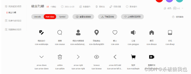
具体的步骤: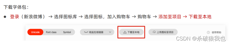
使用字体图标
-
复制相关的文件,到 fonts文件夹里面。
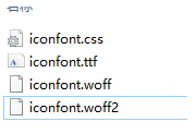
-
引入 css
<link rel="stylesheet" href="./fonts/iconfont.css">
-
如果是一个标签来使用字体文件,可以采取2个类名的形式。(重点)
<span class="iconfont icon-daohangdizhi"></span>
-
第一个类名
iconfont目的是告诉这个盒子里面的文字是字体图标。 不是普通的文字。 -
第二个类名
icon-daohangdizhi, 告诉盒子到底使用哪个小图标。
-
-
如果使用unicode编码(了解)
<strong>  </strong> css: strong { font-family: 'iconfont'; } -
如果是伪元素:
<div class="car1">购物车</div>
这样结构比较的清晰,省了很多的小盒子
 .car1::before {
     content: '\e8c6';
     color: blue;
     margin-right: 5px;
     font-family: "iconfont" !important;
 }
 .car1::after {
     content: '\e665';
     font-family: "iconfont" !important;
 }
二、变形 transform
位移
语法:
 transform: translate(x, y);
 transform: translateX(x);
 transform: translateY(y);
问题:
-
他和margin有啥区别。
-
margin移动盒子会影响其余的盒子。把其他人挤走
-
位移translate移动盒子不会影响其他的盒子。不脱标。
-
注意:
移动的时候可以写百分比,如果使用的百分比,移动的是盒子自身的宽度
transform: translateX(100%);
应用:
可以让一个子盒子在父盒子里面水平和垂直居中。
.father {
position: relative;
width: 500px;
height: 500px;
background-color: pink;
margin: 100px auto;
}
.son {
position: absolute;
top: 50%;
left: 50%;
/* 百分比,往上走盒子自己高度的一半,往左走盒子宽度的一半 */
transform: translate(-50%, -50%);
width: 199px;
height: 199px;
background-color: skyblue;
}
开门大吉案例
效果:
<!DOCTYPE html>
<html lang="en">
<head>
<meta charset="UTF-8">
<meta http-equiv="X-UA-Compatible" content="IE=edge">
<meta name="viewport" content="width=device-width, initial-scale=1.0">
<title>Document</title>
<style>
* {
margin: 0;
padding: 0;
box-sizing: border-box;
}
.box {
overflow: hidden;
width: 1366px;
height: 600px;
margin: 50px auto;
background: url(./images/bg.jpg) no-repeat top center;
}
.box::before,
.box::after {
content: '';
width: 50%;
height: 600px;
transition: .5s;
background: url(./images/fm.jpg) no-repeat;
}
.box::before {
float: left;
background-color: pink;
}
.box::after {
float: right;
background-color: purple;
/* 背景图片右对齐 */
background-position: right center;
}
/* .box:hover
.box::before */
/* 鼠标经过 box 大盒子, 两个子盒子(before 和 after)来拉动 */
.box:hover::before {
/* 百分比是盒子自身的宽度 */
transform: translateX(-100%);
}
.box:hover::after {
/* 百分比是盒子自身的宽度 */
transform: translateX(100%);
}
</style>
</head>
<body>
<div class="box"></div>
<div class="demo">
<span></span>
</div>
</body>
</html>
旋转 rotate
语法:
transform: rotate(45deg); 一定写单位
如果是正度数,则是顺时针旋转
如果是负度数,则是逆时针旋转
设置中心点 transform-origin
/* 设置旋转的中心点位置 */
transform-origin: right bottom;
多形态变形小技巧
-
如果也需要移动,也需要旋转,则一定先写移动,后写旋转
transform: translate(-50%, -50%) rotate(360deg);
-
注意,多个值之前用 空格隔开。
缩放 scale
语法:
transform: scale(1.2);
它比这宽度和高度最大的优势: 他是用中心点来进行缩放的,同样他不会影响其他的盒子。